

How would things work if you could predict the answers to various financial “what-if” scenarios?
At Yavapai College, a community college in Prescott, Ariz., we can. To make informed decisions, our leaders use our Instructional Cost Dashboard, a Web-based business intelligence tool that calculates discipline-level instructional cost data, subsidy data, and faculty productivity data. The dashboard has helped us to reallocate costs, determine tuition pricing, make adjustments to class capacities, inform staffing decisions, plan programs, report profit and loss, and spark entrepreneurial ideas to generate revenue.
Honored with a NACUBO Innovation Award in 2014, the instructional dashboard can be applied to other institutions. Here are the details of its planning and implementation.
How It Works
The Instructional Cost Dashboard presents the Yavapai College (YC) instructional costs per student credit hour by discipline, using the methodology defined by the National Higher Education Benchmarking Institute’s Kansas Study of Community College Instructional Costs and Productivity.
In this way, we can compare our cost efficiency to that of nearly 350 of our national peers. In most cases, the dashboard will also indicate why our costs vary from the national norm: usually because of the faculty carrying load (student credit hours per semester); the number of nonfaculty instructional support staff; or the proportion of credits taught by adjunct instructors.
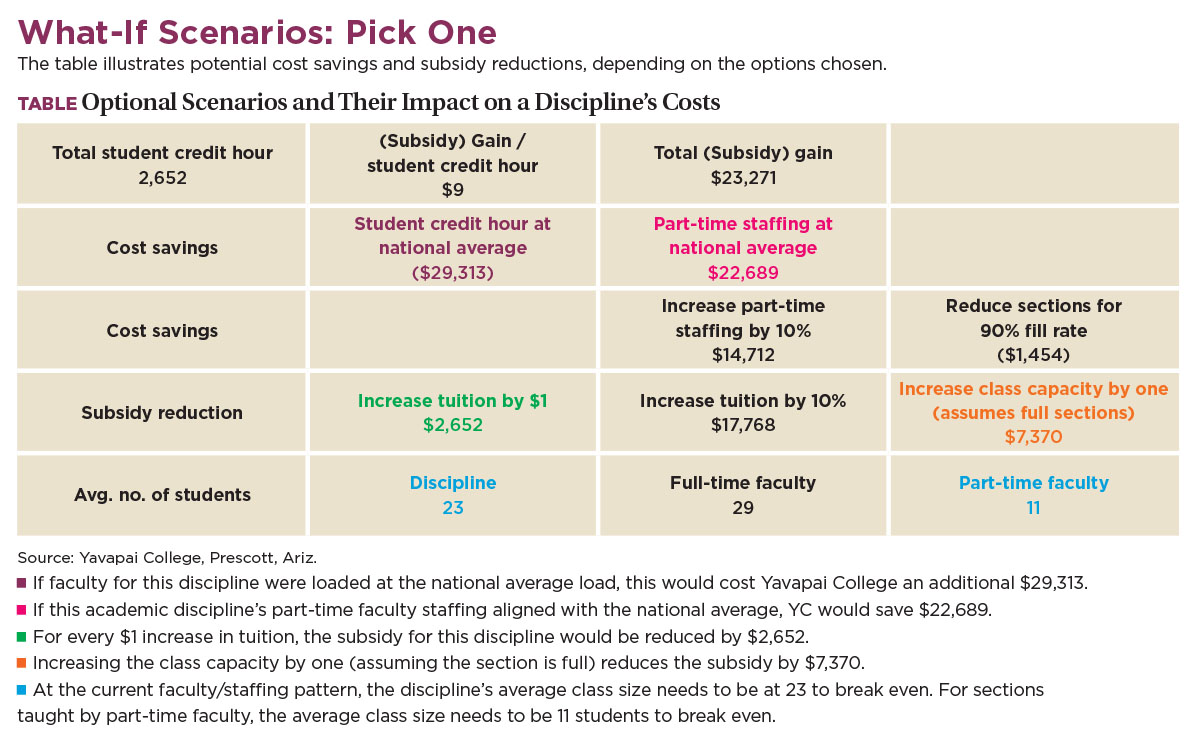
In addition to the national costs data, Yavapai College has integrated into the model the variable revenues per student credit hour (primarily tuition, fees, and state appropriation), so that we can easily see which disciplines are financially self-sustaining and which are being subsidized. The model graphically presents a side-by-side comparison of the 10 disciplines with the highest subsidies and the 10 disciplines that are the least efficient compared to our national peers (see figures 1 and 2).
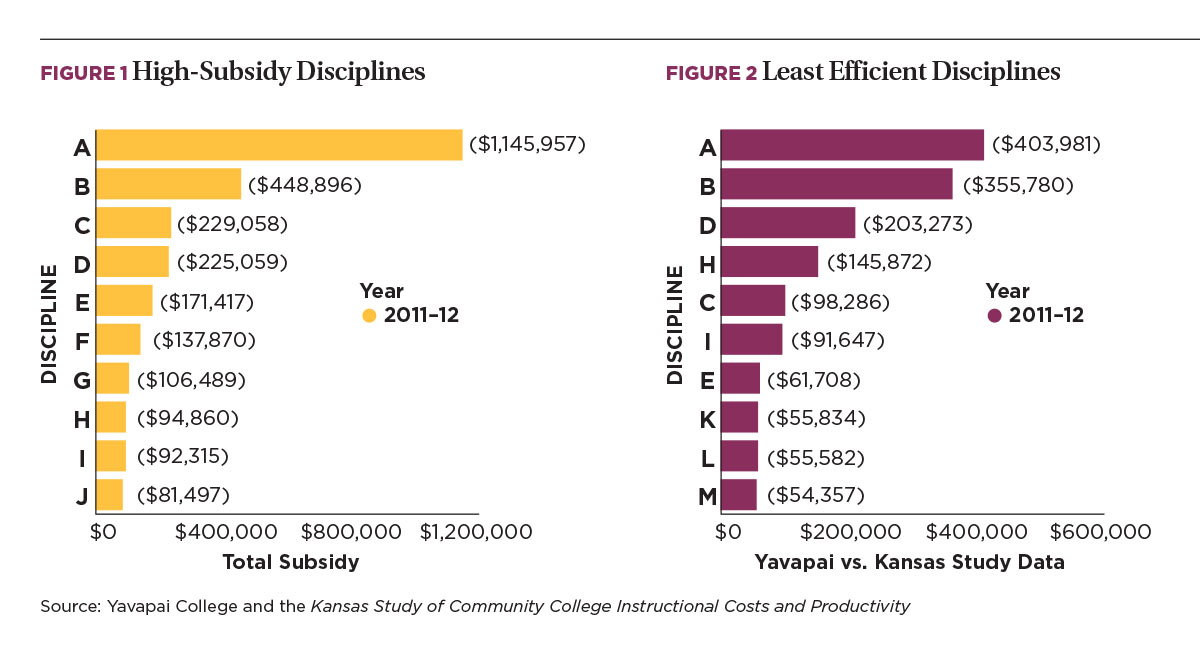
Because there is a high level of replication, the lists often present the college with opportunities to reduce subsidies by learning how our national peers manage costs for a particular discipline, rather than by simply raising tuition or fees.
Everyday Examples
The dashboard creates a transparent source of information that we can use to inform difficult reallocation discussions. Rather than mandating across-the-board cuts, we now can focus our cost-reduction efforts more productively.
Here are several examples that demonstrate how we put the dashboard into action:
Hiring more adjunct instructors. Recently, one of our full-time faculty members retired. Per the dashboard, the retiree’s discipline received a $450,000-per-year subsidy (revenue, minus expense) and a $350,000 premium (YC cost, minus national average cost). Since we had a reasonable ratio of adjunct and full-time professors for this discipline, we decided to backfill the retiree’s teaching load with adjunct instructors. This will reduce our cost premium for this discipline, compared to our national peers, by approximately $50,000 per year.
Reducing cost premiums. We recently investigated our discipline with the largest subsidy. To no one’s surprise, this allied health discipline had a high subsidy, with instructional costs well beyond the variable revenue. However, according to the dashboard, we were operating this discipline less efficiently than our national peers. Our new program director has changed faculty load to be more in alignment with national norms, which has already begun to lower our costs.
Through attrition, we have also been able to reduce the total size of the program, while still meeting the workforce training needs of our district. So far, these changes have allowed us to reduce our cost premium for this discipline by $150,000 per year compared to our national peers.
Keeping cost premiums to maintain quality. We also investigated one of our science disciplines that was operating at a substantial cost premium compared to our national peers. After further discussions with the faculty members and their dean, we learned we were using a relatively unusual combined lecture-lab pedagogy, which helped students immediately apply what was being learned in the lecture. We decided that, in this case, the cost premium was a good value, and we did not make any operational changes.
Determining tuition and fees. First a quick disclaimer: Yavapai College no longer establishes course or program fees. We have moved to differentiated tuition, with three primary levels and a handful of disciplines that charge market-based pricing. Tier 1 is general education, Tier 2is lab courses, and Tier 3 is allied health and career technical education.
The dashboard has the ability to generate a variety of reports, some of which have columns for student credit hour; profit or subsidy per student credit hour; and cost premium (compared to national average) per student credit hour—with each discipline listed on a consecutive row. By grouping disciplines into their Tier 1, Tier 2, or Tier 3 pricing levels, we can examine how efficiently we are managing the tier, compared to the national norm. If we are less efficient, we are less likely to raise the price of that tier. Instead, we would rather improve how we are managing the costs of those disciplines.
Rather than across-the-board price increases, we have started to tailor price increases based on revenue needs, discipline efficiencies, and market conditions.
Faculty Now Pay Attention
At first, faculty and instructional staff did not pay much attention to the dashboard. However, once it became apparent that its data was being used to make budget decisions, people started to kick the tires, and in some cases question the methodology and the data. With faculty and staff input, we discovered and resolved some bugs, and we now have accurate, reliable data. The discussion has now moved from denying the data to understanding what the data really mean, and what actions, if any, are appropriate.
The methodology used to create the dashboard—considering revenues, costs, and productivity—has seeped into our culture and is now part of how we consider new programs. For example, our community has expressed interest in a culinary program, which can be a very costly investment both in initial capital outlay and in annual operating costs. As part of his due diligence, the dean of this area requested Kansas Study instructional cost data. (As a Kansas Study participant, we have access to all of the data collected—not to just the disciplines for which we provided data.)
With increased understanding of instructional cost drivers, the dean proposed starting a hospitality degree program, which has much lower operating costs and no capital costs. As part of the program, we can offer a culinary certificate that YC will provide by renting high school culinary kitchens and using adjunct instructors during the pilot phase of the program.
In another new program example, dashboard methodology helped us think creatively to build a new viticulture and enology program, which will meet community workforce needs. With the help of our foundation, we made a $3.2 million investment in a teaching winery and estate vineyard to support the resurgence of the wine industry in the Verde Valley region of northern Arizona.
At first, we were concerned about the initial capital outlay compared to the projected number of students to be served. But as our financial modeling process matured, we included all the variable revenues, which in this case included not only tuition and state appropriation, but also the sale of the wine. Our models forecast that this program will be not only financially self-sustaining (i.e., cover its instructional costs), but will also generate enough revenue to pay back the initial capital outlay over time.
Without the dashboard methodology, we probably would have pursued a much more modest scope for this program.
Step-By-Step Instructions
Building an instructional cost dashboard requires a crossfunctional team of professionals with skills in programming, database administration, and business intelligence or reporting software proficiency. Also necessary is detailed knowledge of the institution’s finance system, payroll system, human resources data, chart of accounts, and student information system.
To successfully implement an instructional cost dashboard, your institution must be willing to commit the necessary personnel and financial and technology resources to generate a return on your investment. We suggest implementing the dashboard in stages—the first version of the dashboard does not need to include every data element to be a useful tool.
Our dashboard was a true team effort. Our leaders supported the vision to create a cost dashboard, the office of institutional effectiveness and research led the programming, and the budget office helped to navigate the complex finance and human resources data tables and to validate that costs were accurately attributed to disciplines per Kansas Study methodology.
A successful implementation involves six steps:
1. Involve the right people with the right skill sets and experience.
2. Participate in the Kansas Study. Through this process, the institution will learn how and where its cost-related data is stored. As a result, expect to make changes or corrections to the way expenses are categorized.
3. Build data tables to store institutional discipline and cost data.
4. Build data tables to store Kansas Study benchmark data.
5. Write queries in the reporting tool to extract data and produce summarized information. We developed our dashboard using Cognos, an IBM business intelligence solution.
6. Share dashboard results with faculty and academic managers to validate the data. If necessary, make corrections. To be accepted and used by faculty, academic managers, and administrators, data and information from the dashboard need to be transparent.
What Next?
Our current efforts revolve around educating academic managers and faculty to ensure that they understand and are comfortable using the dashboard data to inform decision making. While we have already incorporated the dashboard into several college processes—including budgeting, new programming, and tuition setting—we are exploring whether it may become part of the academic program review process.
We are also discussing expanding the dashboard to monitor noncredit instructional costs and noninstructional costs, although no related national benchmarks for community colleges exist at this time.
With the new economic reality in postsecondary education created by state disinvestment, now, more than ever, easy and quick access to relevant cost data is necessary for informed decision making.
CLINT EWELL is vice president of finance and administration services, and TOM HUGHES is director of institutional effectiveness and research, Yavapai College, Prescott, Ariz.